The Workload Report is a powerful tool designed to give managers and team leaders clear visibility into how time and resources are being allocated across your organization. By understanding who is working on what and for how long, you'll be able to optimize team efficiency, prevent burnout, and ensure projects stay on schedule.
To open the Workload report page, click on the Reports button in the main Toggl Track sidebar, then click on the Workload tab at the top.

Date Picker
If nothing shows up on the summary Report when you first load it, you may need to define a date range for the report. Click on the Date Selector in the upper-left, to choose a custom or preset date range.
See the Selecting a date range article for more details on using the Date Picker, especially for selecting custom date ranges.
Rounding
Enable or disable rounding for your time entries as needed by clicking the Rounding button and then choosing your desired settings.
Read more on Rounding here.
Filters
To run the report for all data, choose no Filters. However, if you want to filter what you are seeing, click on Add Filter button.
You can filter using various properties, and/or filters and therefore create powerful filters to drill down to the exact data you need to see in your reports!
The report updates automatically when you close a filter dropdown. More details are available through the Filtering reports article.
Summary
The Summary bar gives you some basic information about the data in your report.
This bar can show you up to 4 items by choosing them via the 3-dot control at the end. Choose between:
-
Total Hours
-
Billable Hours, as well as the billable percentage,
-
Revenue, your billable hours x billable rate in each of the currencies that the report has data from,
-
Average daily hours, calculated by dividing total hours by number of days,
-
Cost, your total hours x cost rate in each of the currencies that the report has data from,
-
Profit, the difference between your Revenue and Cost in each of the currencies that the report has data from. In the case of a Fixed Fee project, this is the difference between the Fixed Fee and Cost.
-
Fixed Fee, the total fixed fee for the report period. For recurring projects, this is multiplied by the number of periods overlapping the report range.
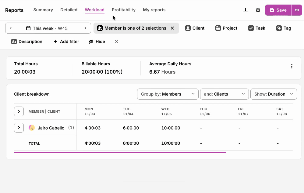
Project Breakdown Table
The heart of this report is the Project Breakdown table, which organizes your data in a clear, customizable format. You'll see your selected grouping categories (like clients, members, or projects) displayed as rows, while your chosen date range appears across the columns. Each cell shows the hours tracked for that specific combination, with convenient totals provided at both the end of each row and the bottom of each column.
At the top right of the table, you'll find controls to customize your view. You can choose to display either Time (hours worked) or Revenue (billable hours × billable rate).
You can also select how you want to organize your data using the primary and secondary grouping options. For example, you might want to see data by Project first, then by Team Member. When you select a primary grouping, the secondary options will automatically update to give you relevant choices.
|
Primary Grouping |
Secondary Grouping Options |
|
Clients |
Members, Projects, User Groups, Tasks or Tags |
|
Members |
Clients, Projects, Tasks or Tags |
|
Projects |
Members, User Groups, Tasks or Tags |
|
User Groups |
Clients, Members, Projects, Tasks or Tags |
|
Tasks |
Members, User Groups or Tags |
|
Tags |
Clients, Members, Projects, User Groups or Tasks |
The table displays your primary grouping as main rows, which you can expand with a single click to reveal the secondary grouping details underneath. This collapsible view keeps your dashboard clean while allowing you to drill down exactly where you need more information.
Utilization Report
The Utilization Report helps you understand how much of your team’s scheduled work hours are being spent on billable work. It provides both individual and team-level insights into workload efficiency.
Please note: This feature is only available on the Premium plan and is only available to admins.
Each cell in the report shows the utilization rate for a member on a specific day, based on this formula:
Utilization = Total Billable Hours ÷ Scheduled Work Hours
-
Below target (71–79%) – highlighted in light yellow
-
Well below target (<70%) – highlighted in light red
This allows you to quickly spot under- or over-utilized team members.
To access the report:
-
Open the Workload tab under Reports.
-
Select Utilization from the top-right dropdown menu.
-
Adjust filters (date range, workspace, user group) as needed.
⚠️ It is important to have scheduled work hours setup on a per-user basis for this report to display correctly.
Adherence Report
The Adherence Report helps you understand how closely your team’s tracked time matches their scheduled work hours. It provides both individual and team-level insights into work hour adherence, making it easier to spot who is under or over-logging time compared to their expected schedule.
Please note: This feature is only available on the Premium plan and is only available to admins.

Each cell in the report shows the adherence rate for a member on a specific day, based on this formula:
Adherence = Total Hours ÷ Scheduled Work Hours
This allows you to quickly spot team members who are logging fewer hours than expected, or those consistently logging above their scheduled hours.
To access the report:
- Open the Workload tab under Reports.
- Select Adherence from the top-right dropdown menu.
- Adjust filters (date range, workspace, user group) as needed.
It is important to have scheduled work hours setup on a per-user basis for this report to display correctly.
Export
Click on the Export button on the upper-right to download the report as a PDF, CSV or Excel file. Please note, CSV and Excel exports are a paid plan feature.