How to build Insights charts in Reports
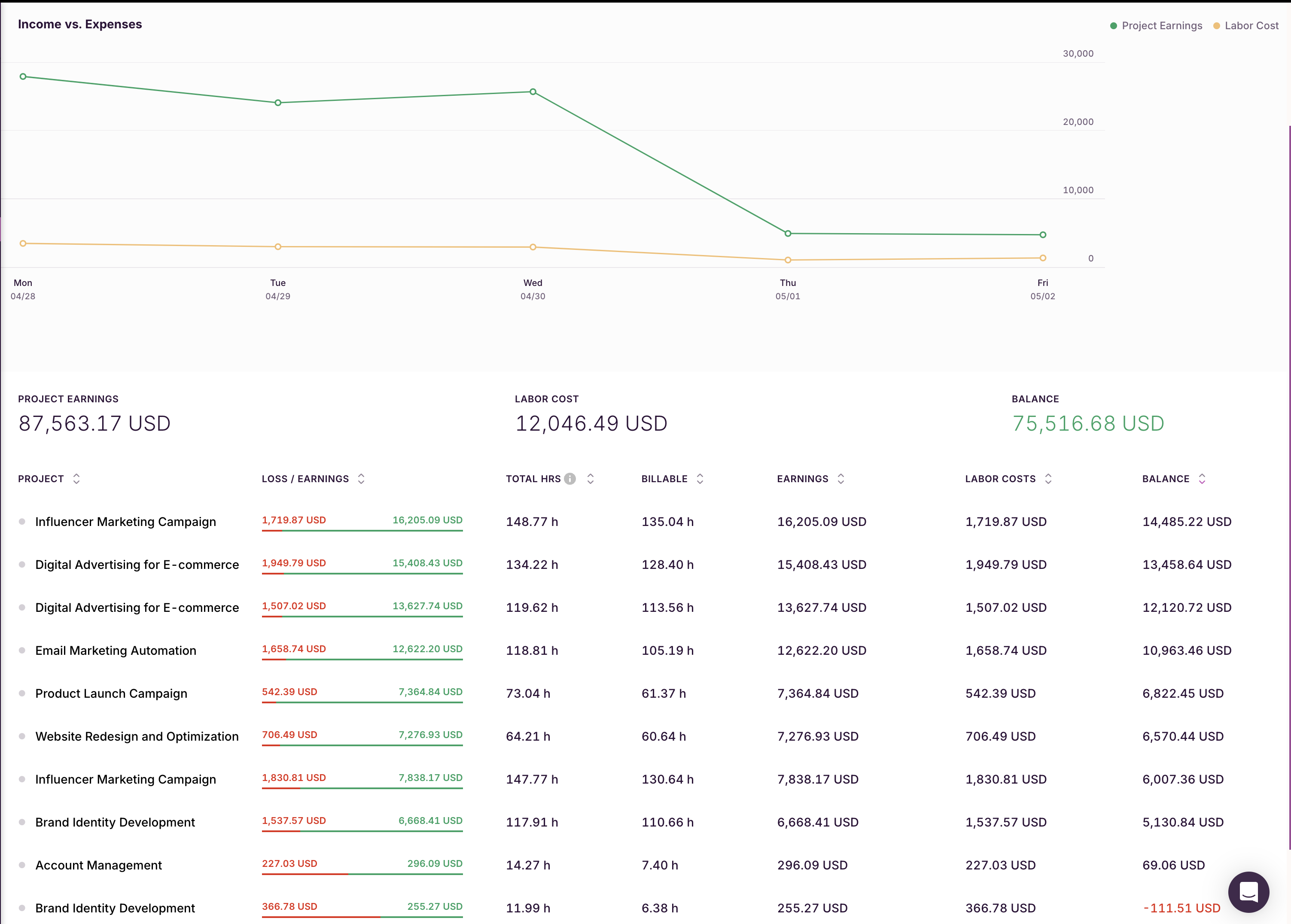
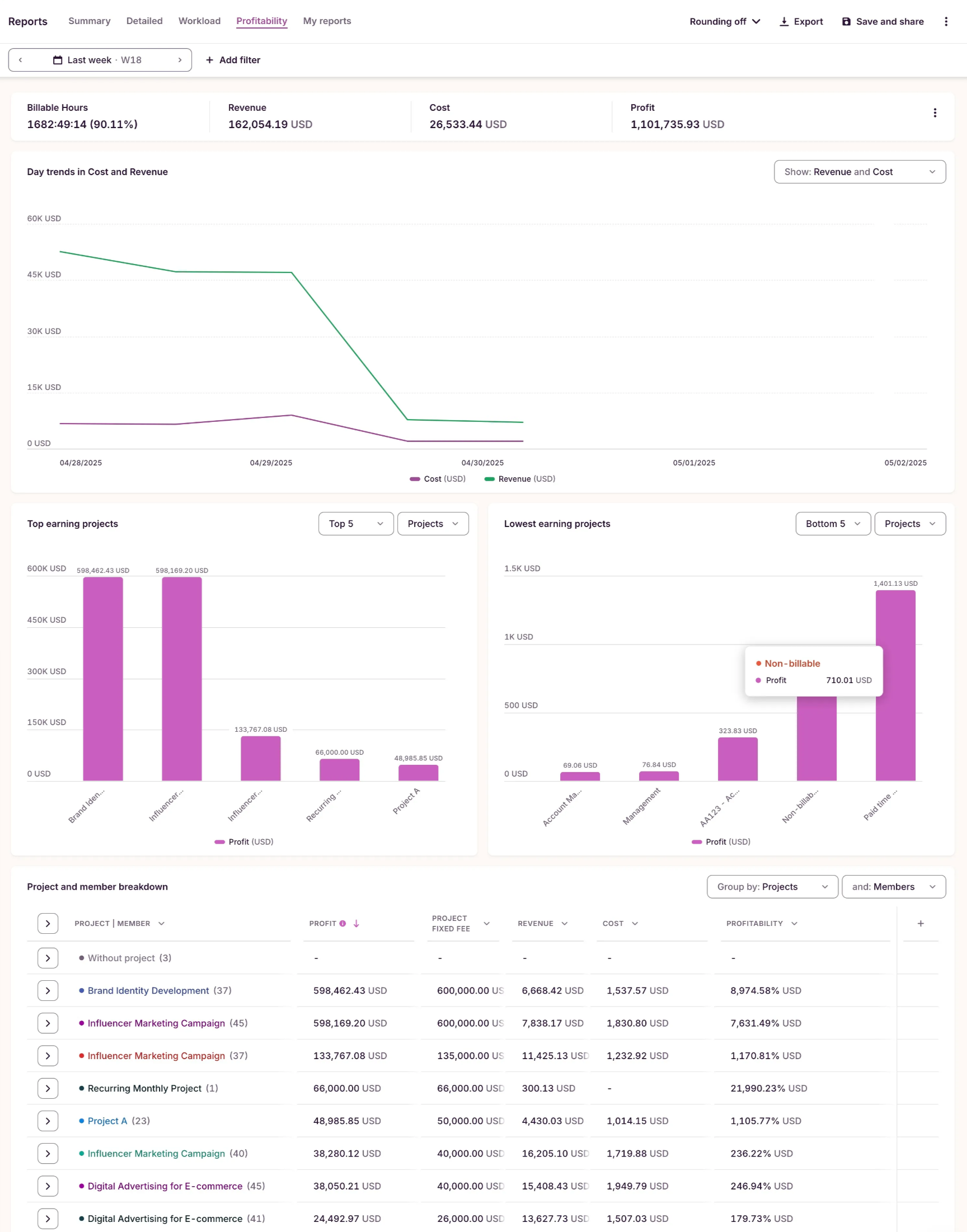
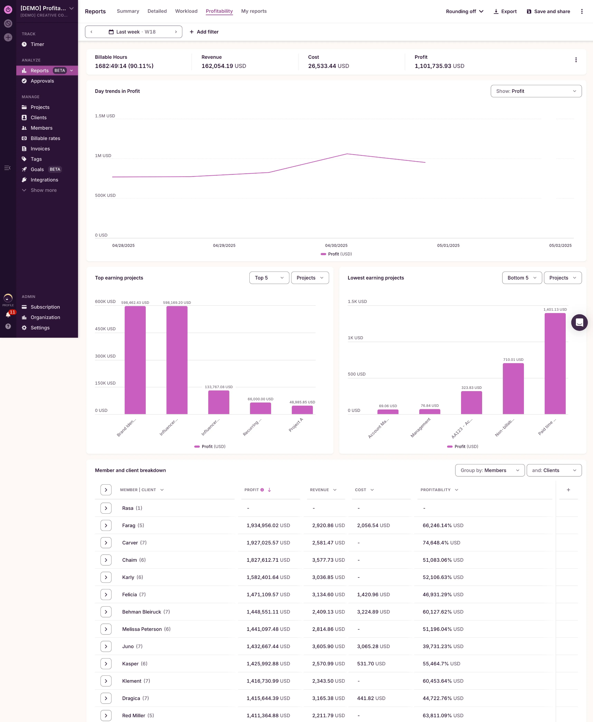
Project Profitability
Insights
New Reports
- Go to Profitability Reports
- Click on the dropdown on the top right corner of the multi-line chart to hide the profit line (optional to look identical to the Insights chart)
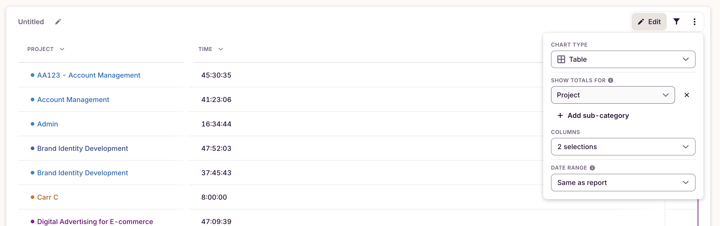
- At the bottom the report, change the first grouping to “Project”
Below is how it will look like:
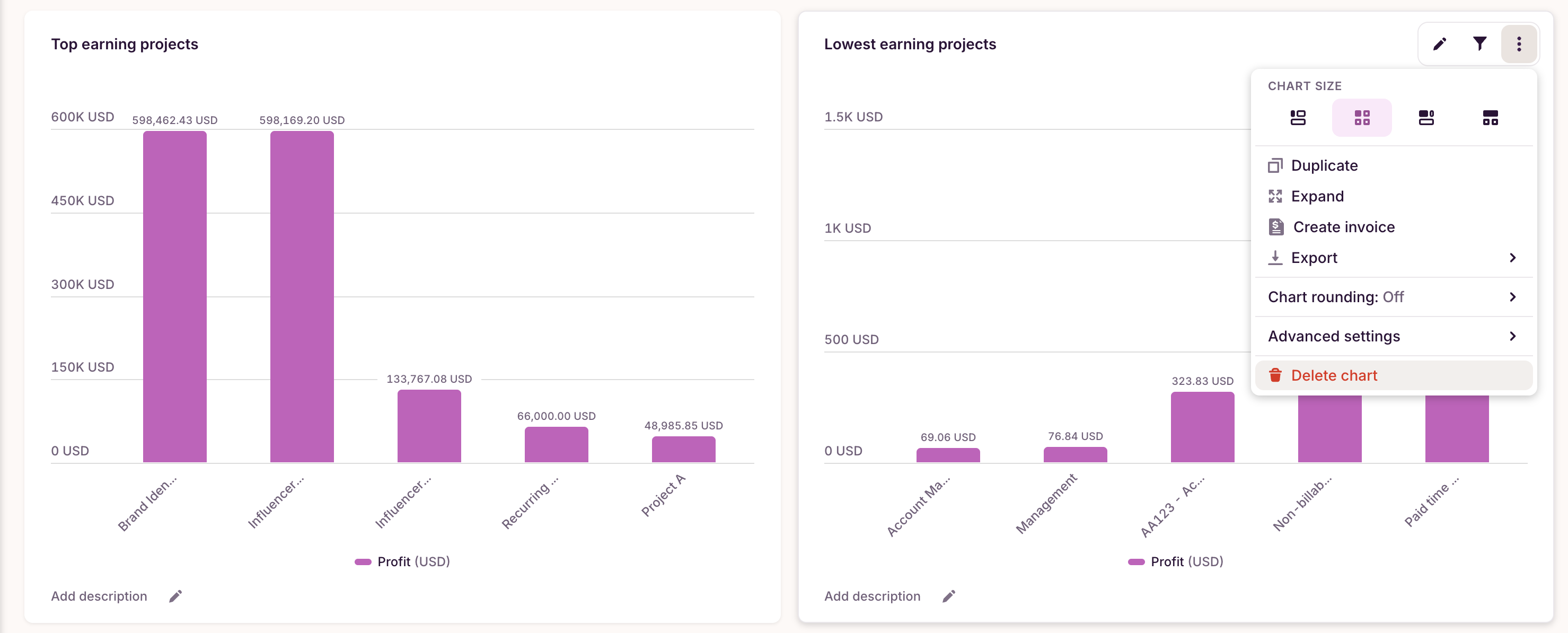
You can save this report and, in your custom reports, remove the two middle bar charts in case you want the report to look even more identical to the one from Insights:
Employee Profitability
Insights
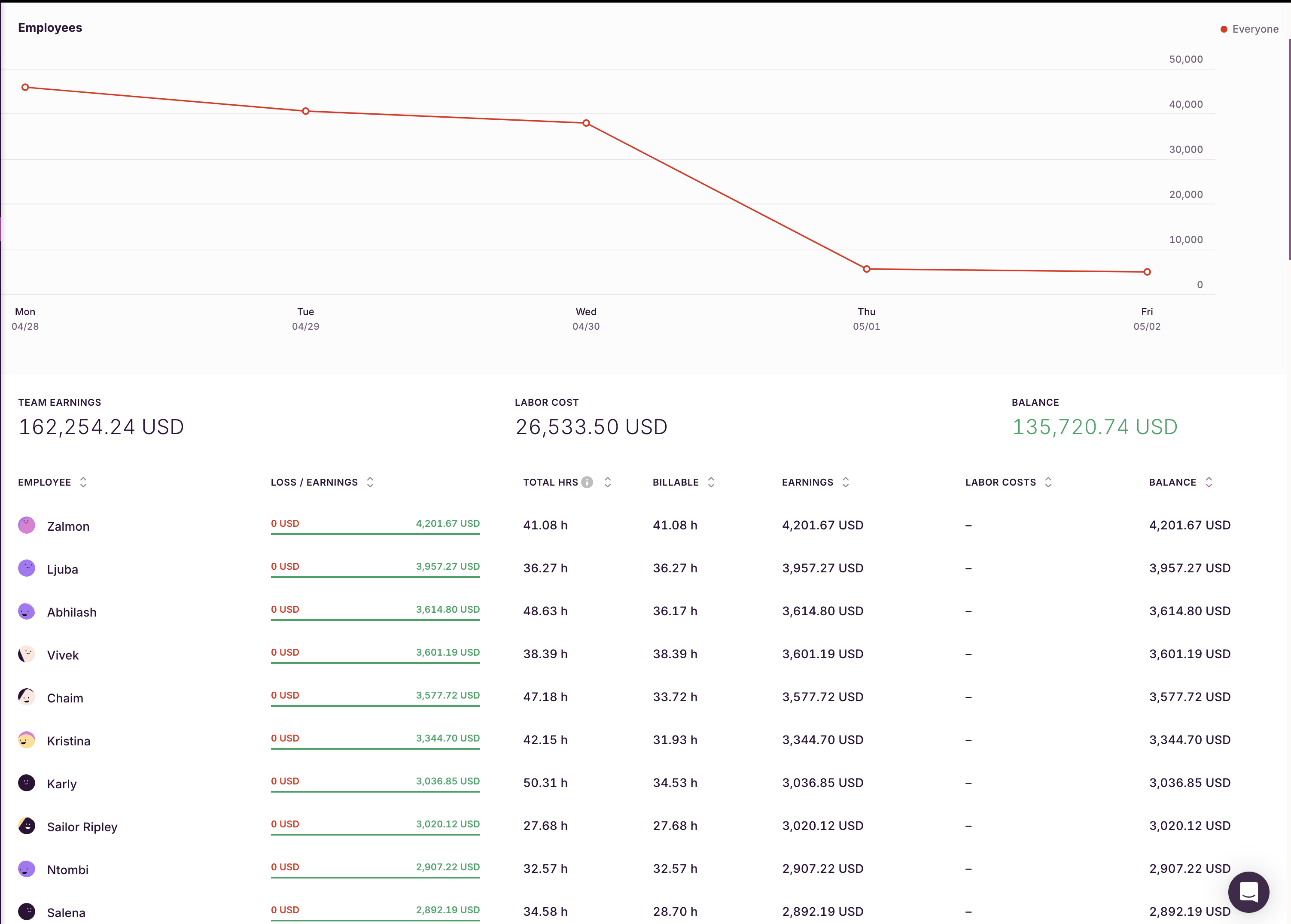
New Reports
- Go to Profitability Reports
- Click on the dropdown on the top right corner of the multi-line chart to hide the revenue and cost line (optional to look identical to the Insights chart)
- At the bottom the report, change the first grouping to “Member”
Below is how it will look like:
Data Trends
Insights
New Reports
- Go to “My Reports”
- Click “New Report”
- Add a “ Grouped bar chart”
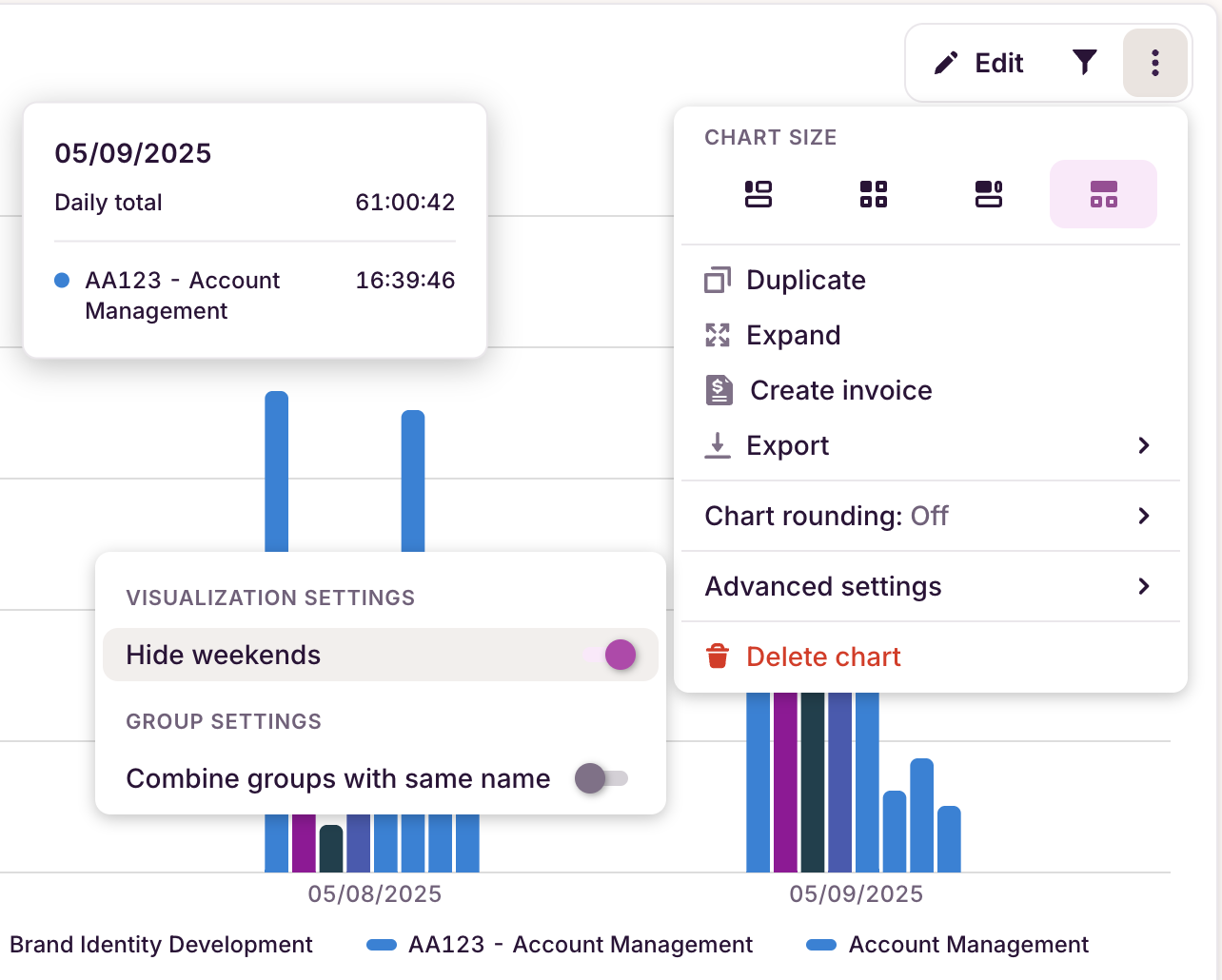
- Configure it like the image below:
- Show: Time
- Bars represent: Projects
- Cluster projects by: Day or Weekday
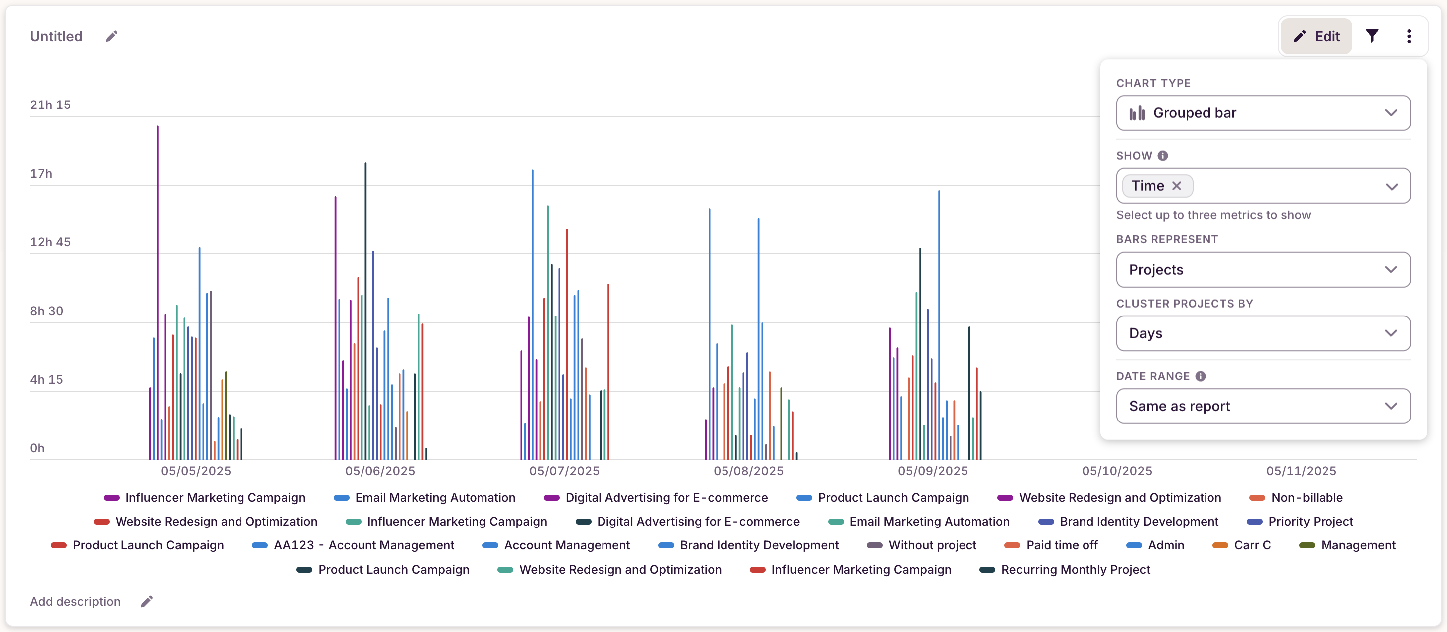
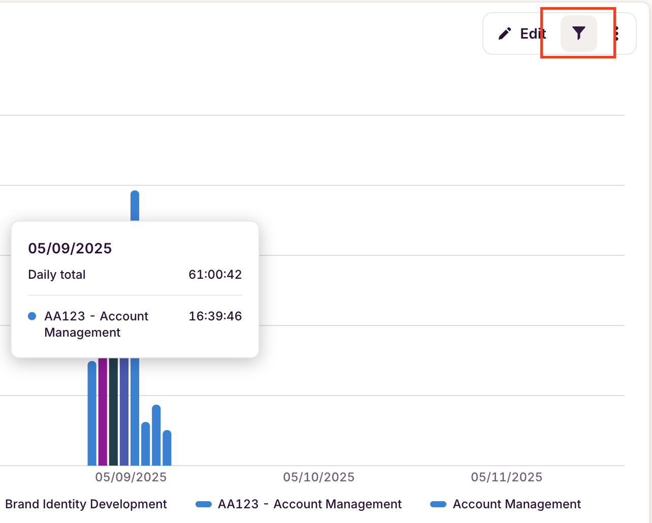
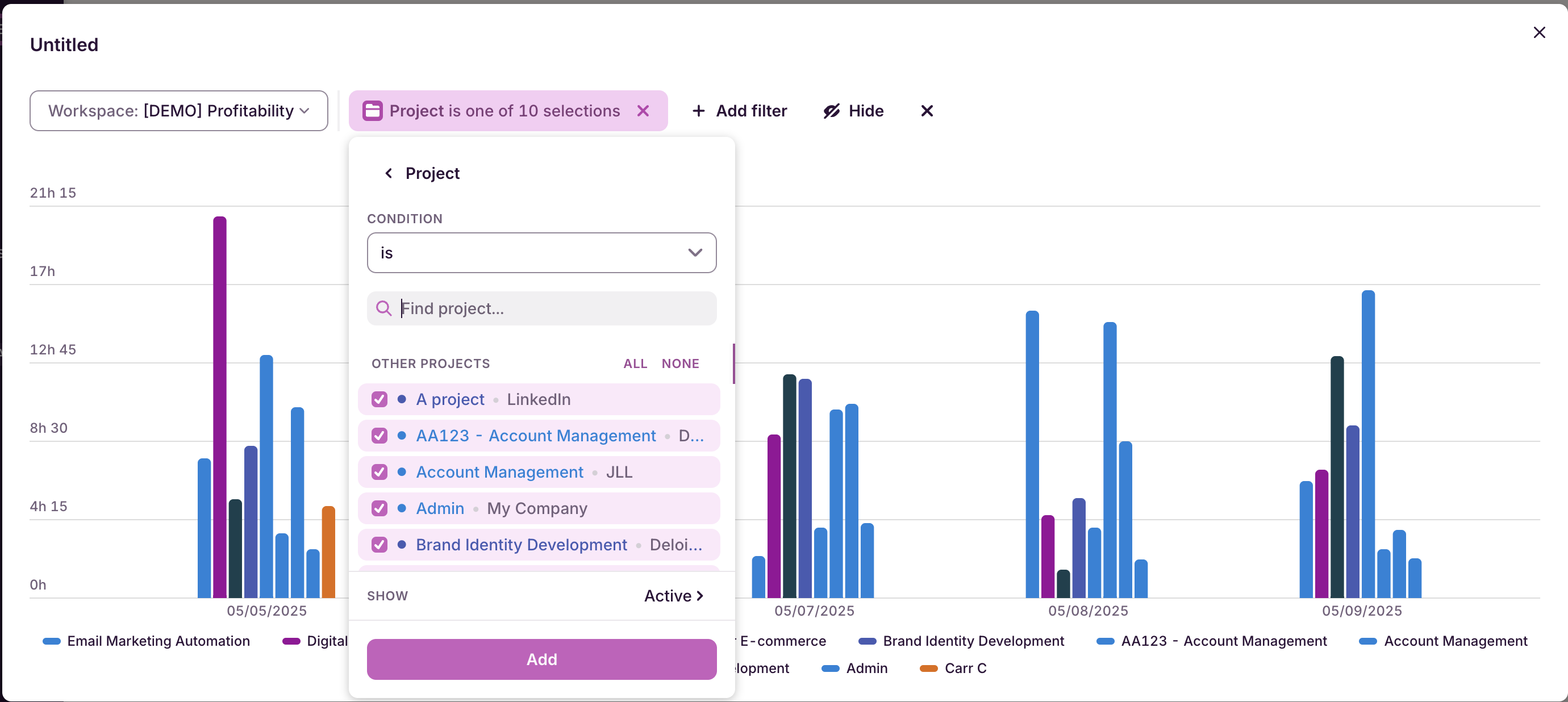
- If you want it too look less crowded, you can filter by your 10 desired projects and hide weekend
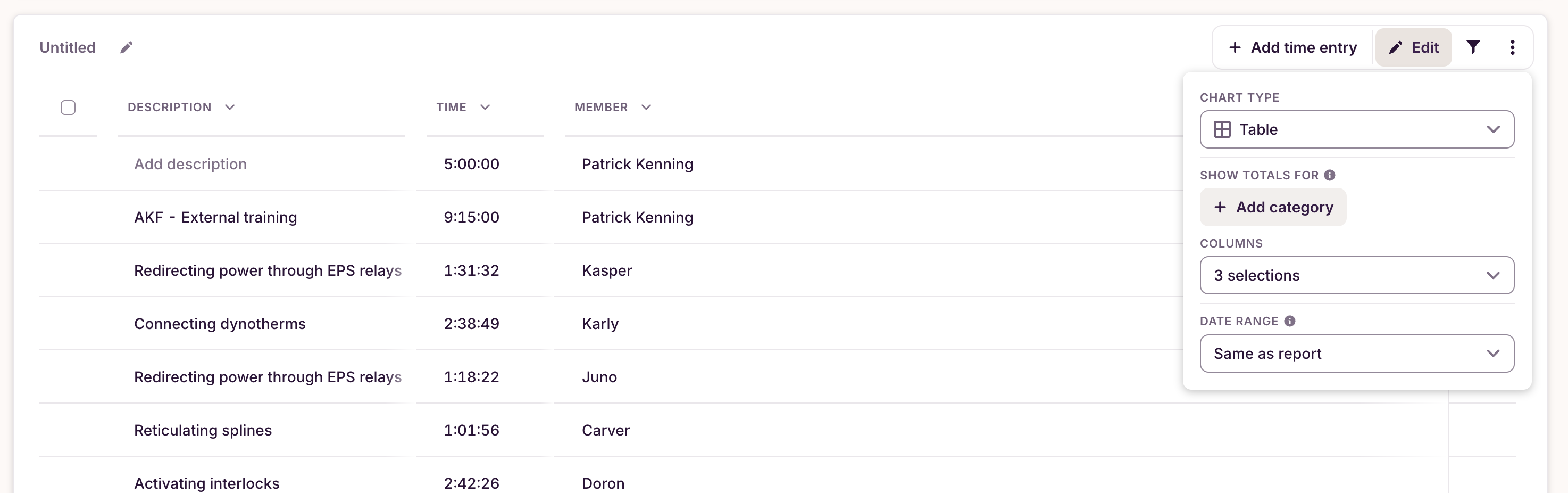
- Lastly, add a table and group it by “Projects”
Comparative
Insights
New Reports
There isn’t an identical multi-line chart in the new reports that overlays a previous period on top of a present period. But the way to get a similar result is by adding two line charts next to each other
- Go to “My Reports”
- Click “New Report”
- Add a “Line chart”
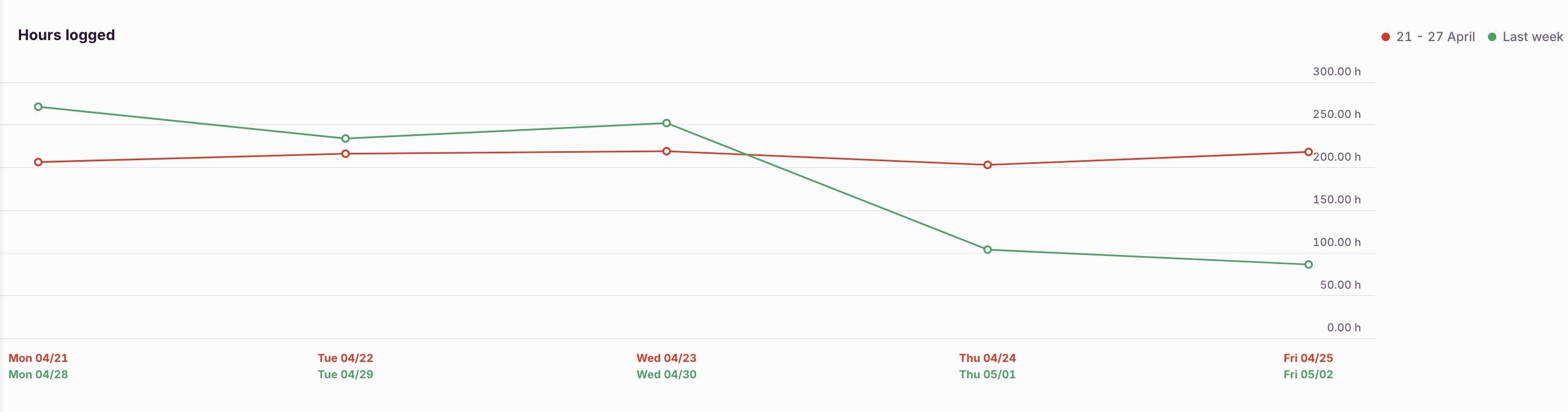
- Edit the line chart period to “Last week” and configure the other fields like the image below
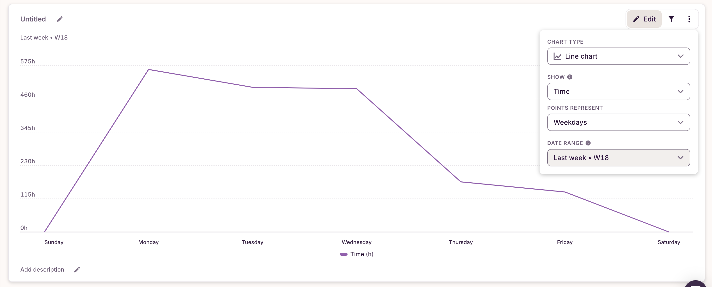
- Add another “Line chart”
- Edit the second line chart period to “This Week” and configure the other fields like the image below
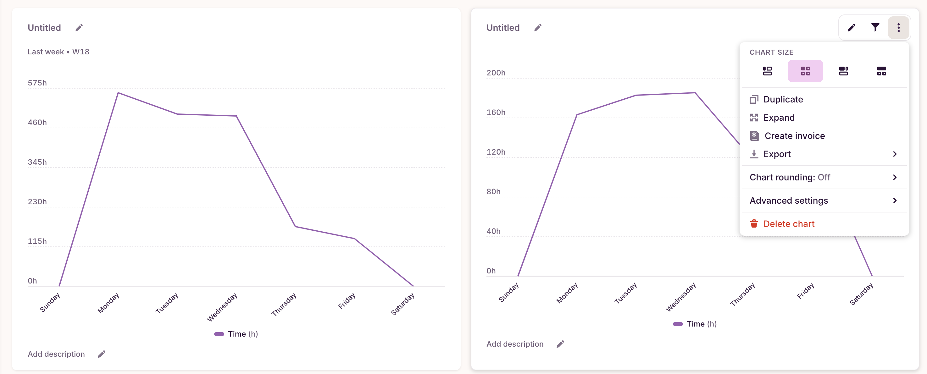
Optional: For better visualization, you can edit the card size to 1/2 each in order to place them side-by-side
Updated on: 06/16/2026
Thank you!